Color Story
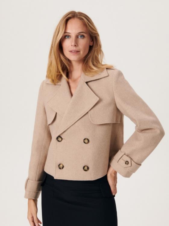
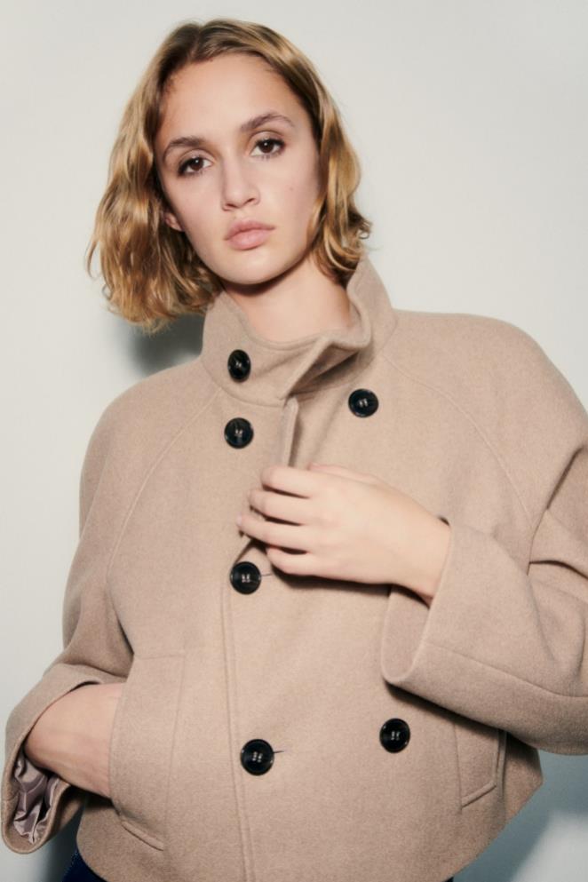
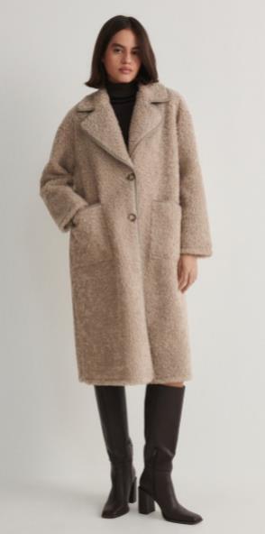
Timeless Taupe
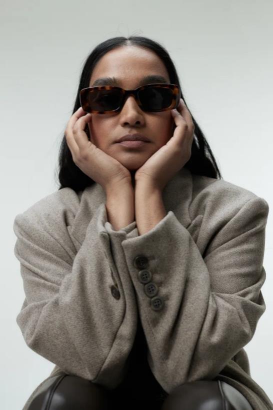
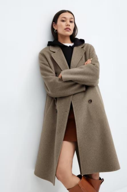
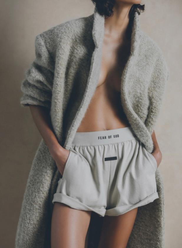
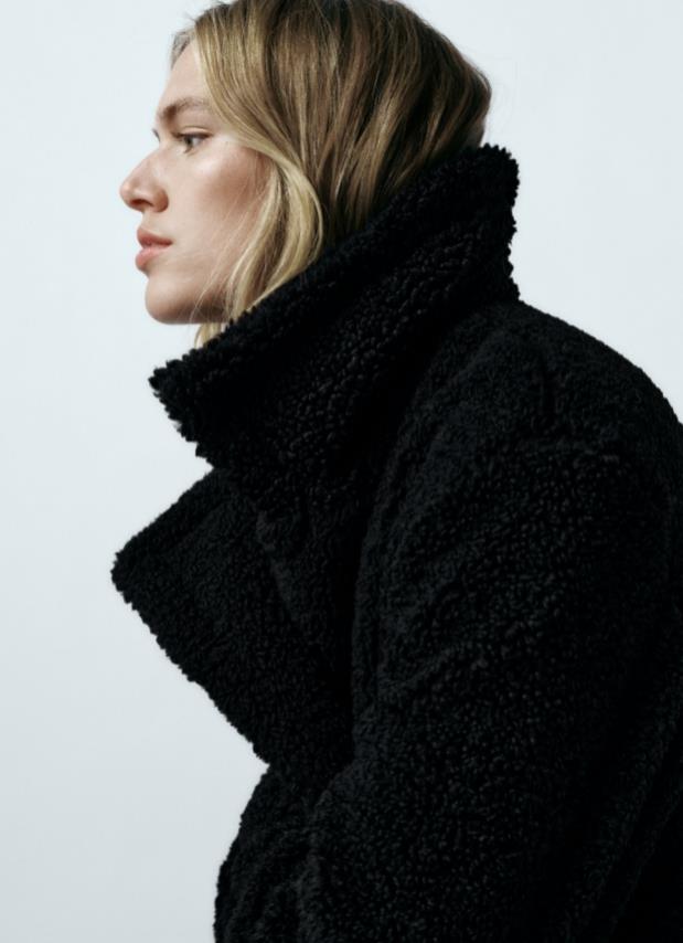
Timeless Taupe confirms the continued importance of transseasonal hues with long lasting appeal, linking to consumers' desire for products and colour with more longevity. Although darker browns will remain relevant, natural mid-level tones such as Timeless Taupe will appeal to those seeking balance.
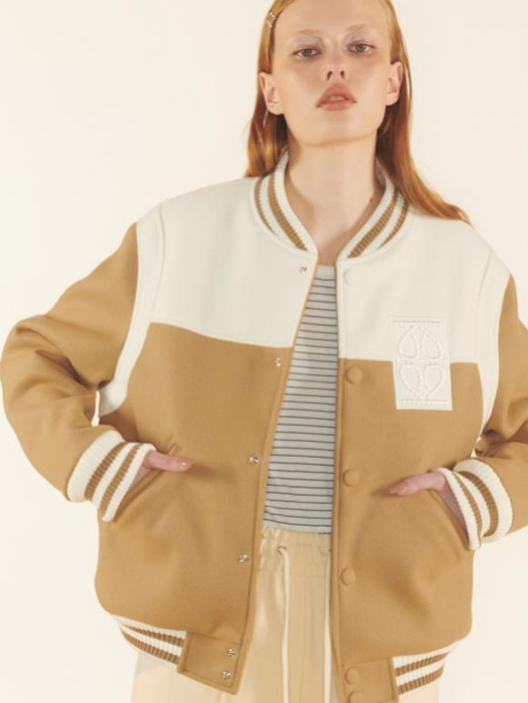
Chalk
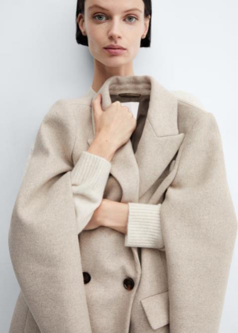
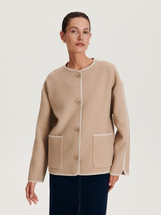
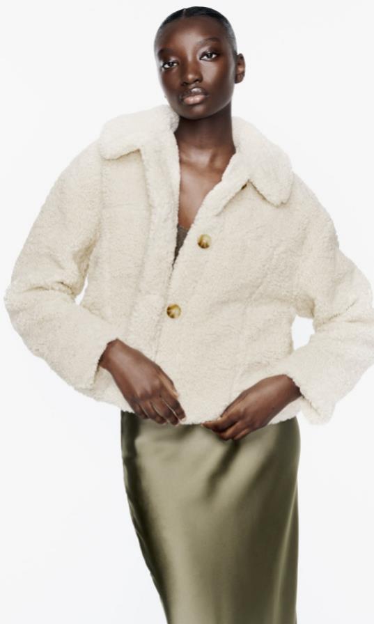
Chalk, a WGSN long-term colour for A/W 24/25, offers balance for consumers overstimulated by highly saturated and hyper-bright shades,craving products with longer lifespans.great for head-to-toe neutral dressing,Chalk pairs well with greys such as Circular Grey (000-64-00) for a futuristic look.
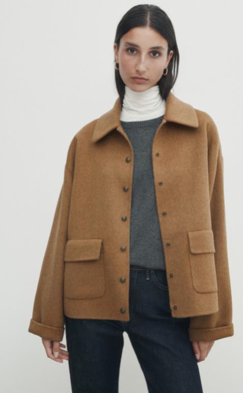
Nutshell
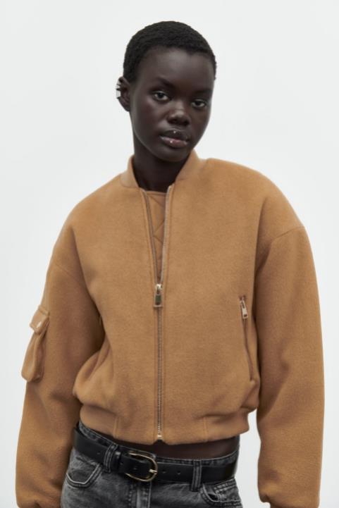
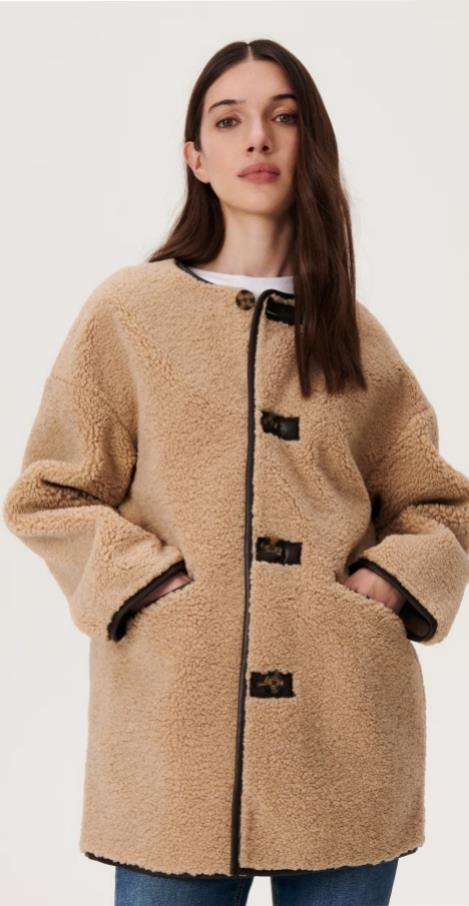
First introduced as a Key Colour for S/S 24, the rich and spicy brown of Nutshell is a transseasonal colour that evokes feelings of warmth and reassurance. Inspired by the growing thrift and resale culture,this colour speaks to sustainability over newness, and appeals to a growing nostalgic sentiment, which is seeing consumers return to retro-inspired styles and colours.

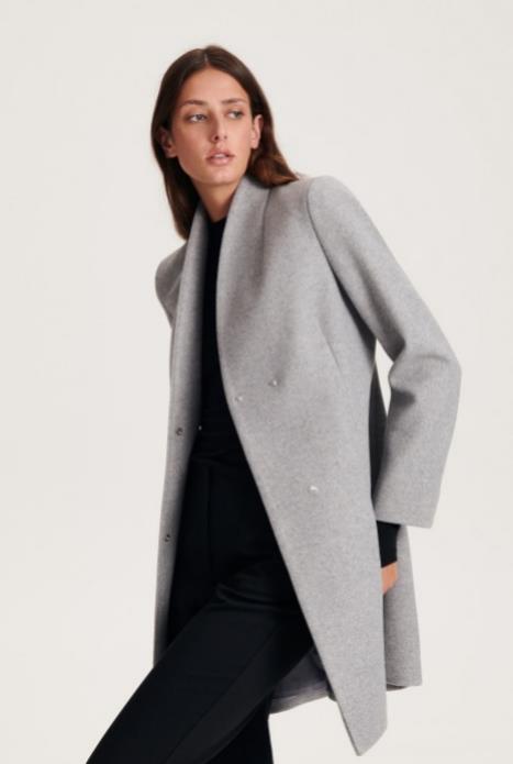
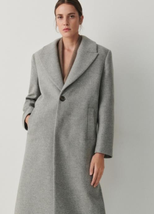
Sustained Grey
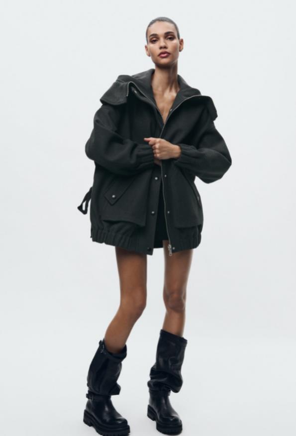
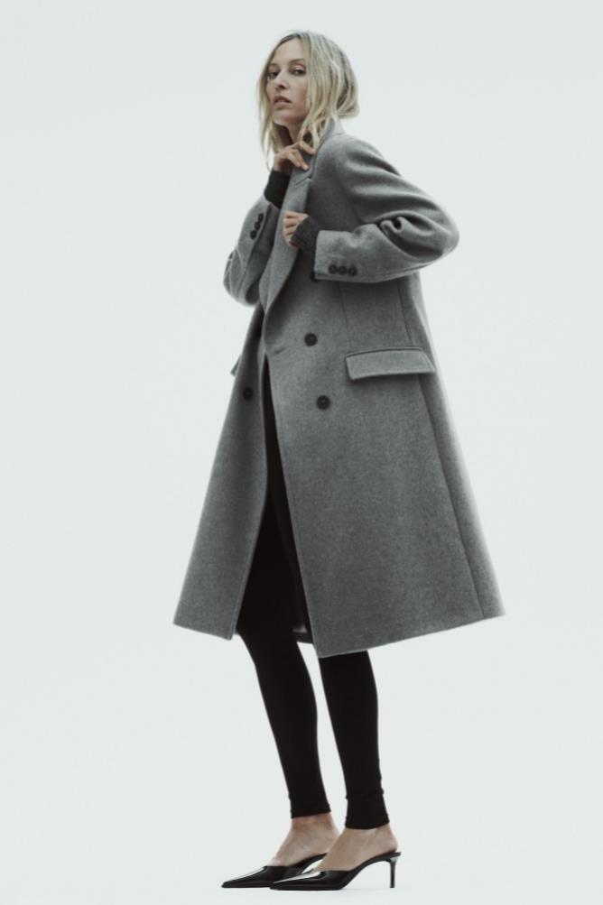
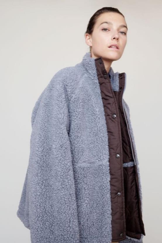
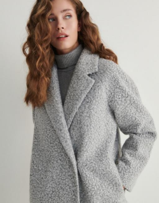
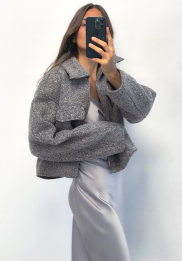
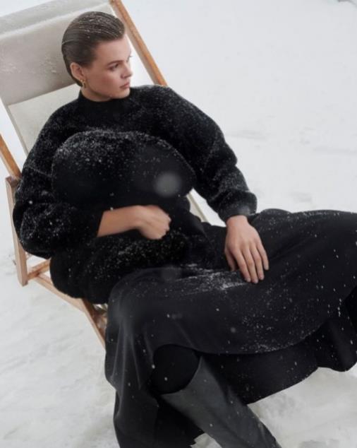
Sustained Grey confirms the continuingimportance of neutrals and more sustainable colour choices which celebrate recyclability and the pursuit of 'just enough'.Representing practicality and reliability, this colour is foundational and grounding, with a utilitarian edge.
Mystic Green
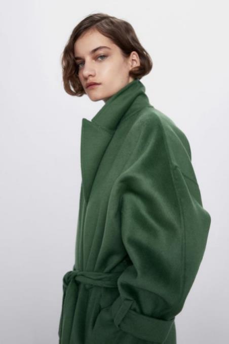
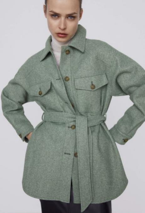
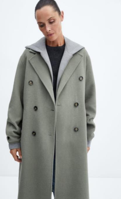
Mystic Green is an intriguing mid-tone that evokes supernatural mysticism and gentle reassurance, whether it be through looking out to the cosmos for guidance or by turning our gaze inwards for solace.lt brings to mind the allure of gemstones such as jade and emerald,enhancing the glamour of Chinese luxury.
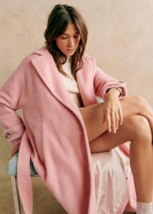
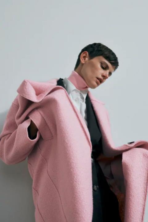
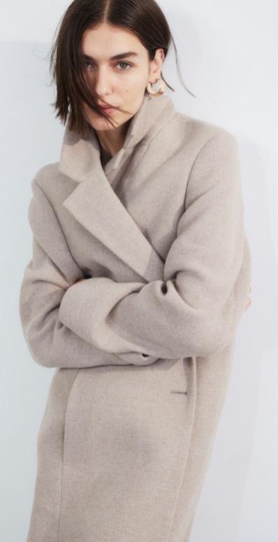
Pink neutrals
with pink undertones likeltalian Clay(022-62-16) and Mellow Pink (022-81-13) present a warm take on neutrals with gender-inclusive and transseasonalappeal.pink neutrals live across categories,feeling new in soft #Sheers and RelaxedSuiting.Apply these tones to silhouettes to achieve #ElegantSimplicity.
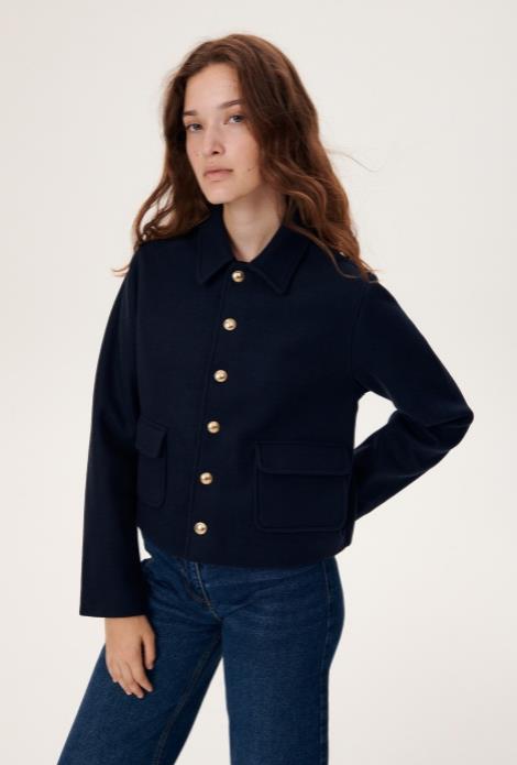
Gentian Blue
Elevate your palette for A/W 24/25 by including this high-impact blue. Sitting between blue and indigo, this is the perfect jewel tone with transitional and transseasonal appeal.
Elemental Blue
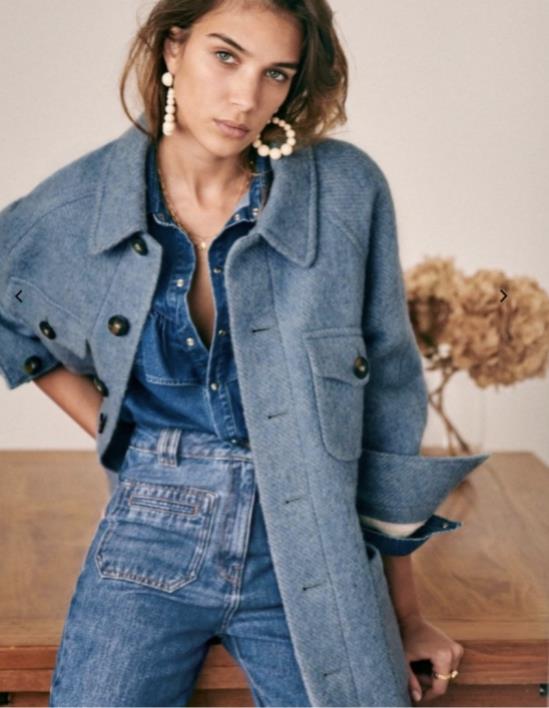
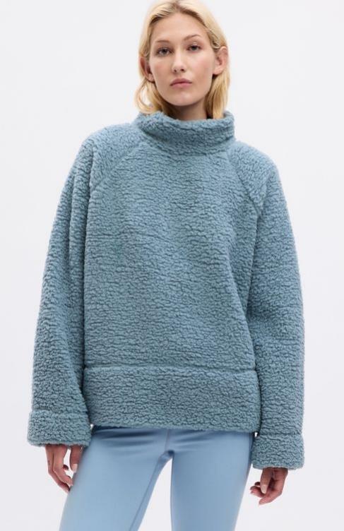
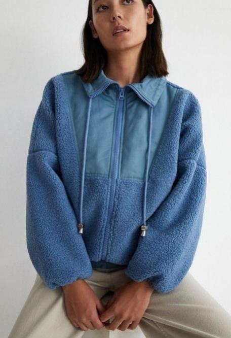
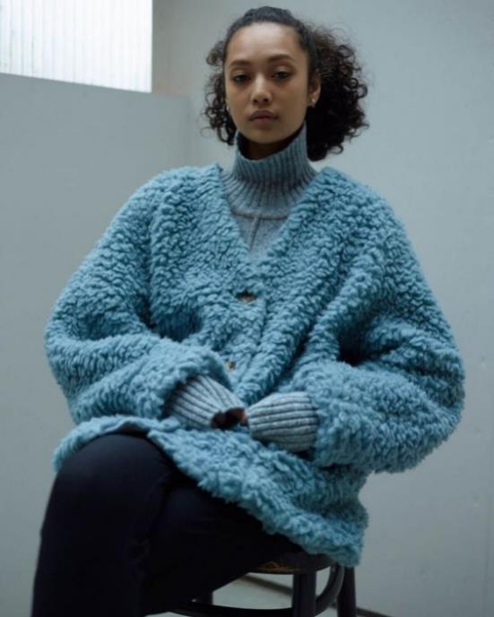
blue will shift from the pastel shade of Glacial Blue to the mid-tone ofElemental Blue.This shade of blue confirms the continuingimportance of refined mid-tones, which speak to slowed- down lifestyles and the pursuit of just enough'. The commercial level ofElemental Blue aligns with sentiments of stability, moderation and balance, but this blue can also feel experimentaland surreal when used in digital and metaverse environments.
Midnight Plum
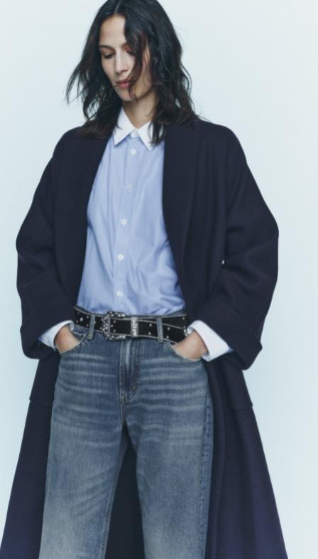
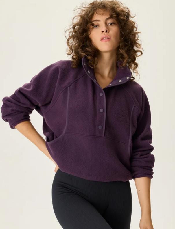
A tinted hue close to black,this colour celebrates darkness,connecting toasense ofmystery, as well as gothic and underground sentiments. lt aligns with the increasing consumer desire for escapism.

Glacial Blue
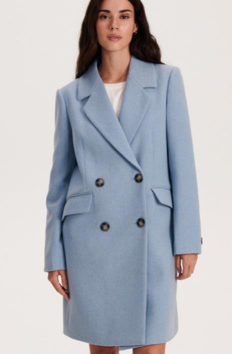
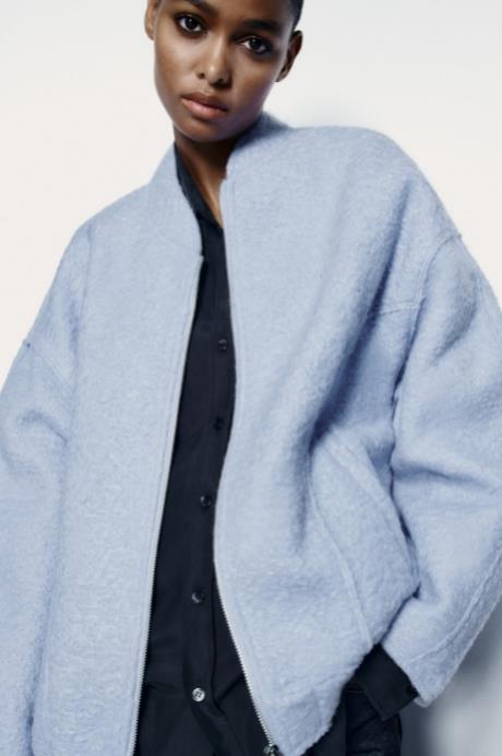
Blue will remain important for the European market, but thisseason we shift from the serene shade of Cornflower to Glacial Blue.First added to the palette in A/W 23/24, Glacial Blue continues to grow in importance due to its low saturation level, which evokes a sense of rest and calm.
Sustained Grey
Sustained Grey confirms the continuingimportance of neutrals and more sustainable colour choices which celebrate recyclability and the pursuit of "just enough'.Representing practicality and reliability. this colour is foundational and grounding, with a utilitarian edge.

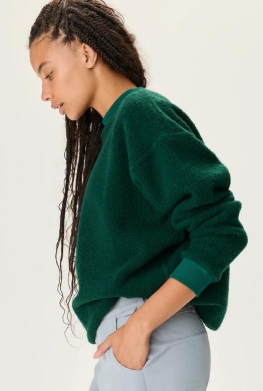
Deep Emerald
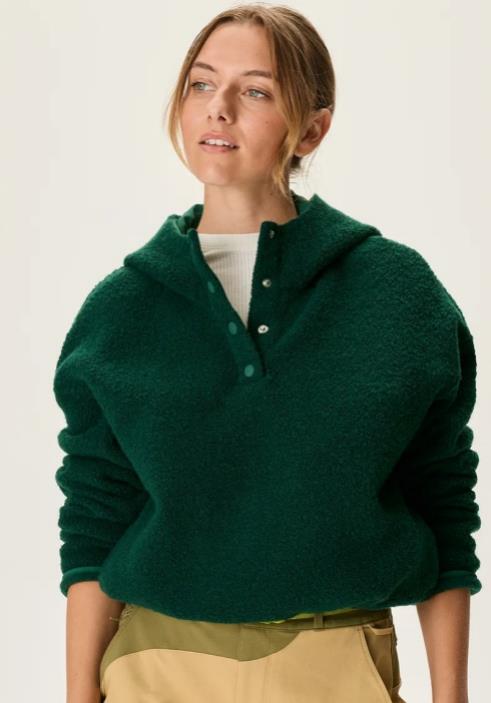
Dark greens has been prominent in the European market for the past few seasons, with A/W 23/24 shade Malachite moving into Deep Emerald for A/W 24/25. With a deep, earthy and natural appeal.
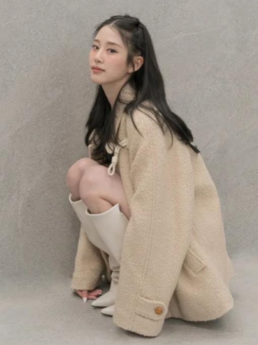
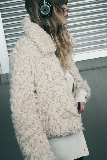
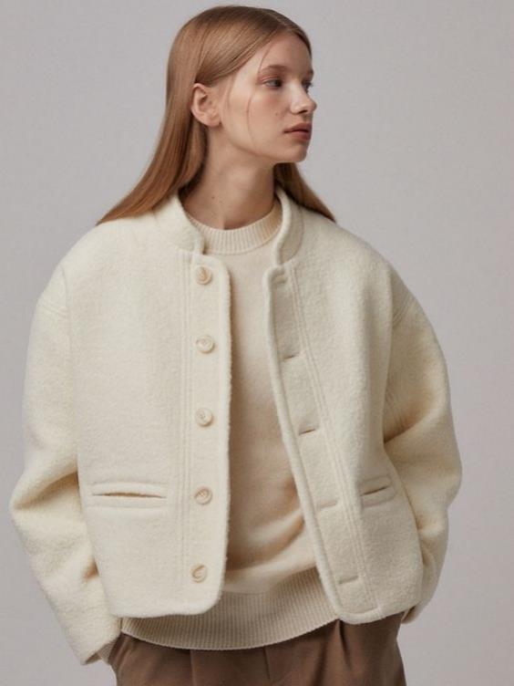
Dusky pinks and naturals
Pinks with a muted,preloved aesthetic advance Resource Ready stories as shades that can be readily produced responsibly. Rustic Caramel adds warmth when used alongside these dusky shades. Use with long-term ltalian Clay or Timeless Taupe to offer longevity to pieces,especially outerwear and knitwear.
Biophilic greens
Greens have a strong connotation to the natural world and will continue to beimportant as the need to be Resource Ready intensifies the drive for moresustainable consumption.Wild Green brings a fresh lushness to the paletteand can be grounded with earthy long-term Sepia. Sea Kelp adds an aquaticelement that speaks to new innovations in seaweed and algae uses in productdesign.Use this palette for everyday pieces,including bottomweights, dresses.outerwear and utility-inspired ranges.
Digital Lavender
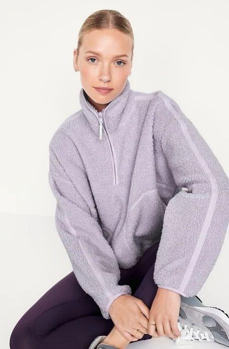
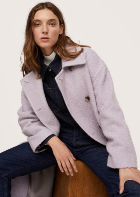
Achieve earth-inspired hues via more sustainable. natural pigments and traditional processes. #EnhancedNeutrals with pink undertones like ltalian Clay(022-62-16)and Mellow Pink(022-81-13)present a warm take on neutrals with gender-inclusive and transseasonal appeal.

Force Blue
From the spring/summer of 2024 to the fall/winter of 2024/25, the blue evolved from pink wax Glacier blue to medium tone Force blue. Force Blue confirms that color palette is still important in elegance,reflecting a slower lifestyle and the pursuit of "just right." The commercial appeal of Force Blue is matched with a sense of stability, moderation and balance, while this blue has an experiential and surreal feel when used in digital and meta-cosmic scenes.
